

The f-Stops Here
A series of columns on outdoor photography
Learning - and Breaking - The Golden Rule
by Sharon Watson
Two thousand years ago when Pythagoras asked his students where a knot should be tied in a piece of string to make it look "aesthetic," they decided it was about .38 of the way in -- off center.
There¡¦s something about our sense of visual balance that prefers an element of "movement." They named this phenomenon, "The Golden Mean." In photography, it has evolved into "The Rule of Thirds." I call it, "The Golden Rule," and use it as a guideline for eye-pleasing compositions in my photos.
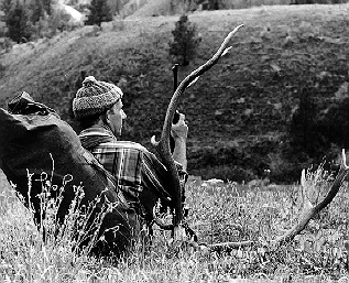
Essentially, the rule requires pictures be divided up into nine equal parts (three sections of thirds, horizontally and vertically). This "grid" has four points at which the lines intersect -- called "golden sections." Depending on other factors, it is at or near these points that a photo¡¦s main subject should probably be placed. A hiker hoofing through the White Cloud Mountains, for example, might be a tiny speck in an overall mountain scene, but she will look best if placed near a golden section.
The theory is that using the Rule of Thirds creates tension and therefore energy and interest in your photos. It causes the eye to travel into a photo in a more calculated and effective manner. And, it makes a photo "feel right."
Other generalities have spun off this Golden Rule:
1. Don¡¦t center your subject. The center is called the "static zone."
2. Don¡¦t place the horizon exactly in the middle.
3. Don¡¦t place the main subject in only one of any thirds¡¦ section. Something must draw the eye to or from at least one other corner to provide balance.
4. Don¡¦t place a "moving" subject (say, a speeding boat) in an edge section facing out of the picture. It¡¦s too active; the viewer feels he¡¦s about to lose the subject.
5. Don¡¦t place even an inward-facing subject too close to an outer edge of any section. It draws the eye too far over, and the rest of the photo usually feels lost.
In addition, be careful with the placement of diagonal lines like fences, trails, rivers and also highly textured, colorful, dark and light areas. These draw the eye and may lead attention away from the subject or off the edge, or otherwise ruin a desired effect.
If your photo seems not to follow the Rule of Thirds and feels right anyway, there are probably other elements in the picture giving it balance. The horizon might be centered, but perhaps the foreground leads the eye to the subject, providing "movement." The subject matter may demand centeredness where the eye can look nowhere else -- a shot of you, maybe, with that big bass you caught at Lake Lowell near Nampa, Idaho! Or, your intention might be to deliberately "snag" the viewer¡¦s eye. A runner at full stretch facing the very edge of the picture, one toe out even, might convey an even greater sense of tension and moving energy. Add a little blur to the runner with a slow shutter speed and the effect is further enhanced.
We aren¡¦t all born with a "seeing eye," but this golden rule can help develop it. It is meant to teach, though, not imprison. Play around with it, learn from it -- and break it as needed.
Copyright © 1998 Spring Creek Communications